Hoojah is an online poll & debating site for Malaysia. It's a pet project that I started working on in 2013. People can go to the platform, create polls and vote for other polls, and also take each other on in one-on-one debates.
Hoojah · user interface
Responsibilities
Research, design and build
Technology stack
HTML, SCSS, Adobe XD, Ruby on Rails, ReactJS, Discourse, Docker
Hoojah is a polling platform, but the votes aren't really the point. The arguments behind them are. You vote on a poll, back your stance with arguments, and if you want, take someone on in a one-on-one debate. The hard part was never collecting votes, it was getting people to actually discuss things instead of shouting past each other. So I kept the voting dead simple and put all the weight on the arguments. Capping each poll at three options started as a way to cut noise, and it turned out the constraint made everything clearer. I built Hoojah because I was tired of how messy and polarised online discussions had become.
02 · why it annoyed me
Background
The Inefficiency of Online Discussion Platforms
Today Malaysians use social media platforms and online forums to discuss important matters. The trouble is it's hard to track anything: different groups talk about the same topic in their own corners, so you never get a clear, structured read on what people actually think. Trying to follow an important discussion across all of that always frustrated me.
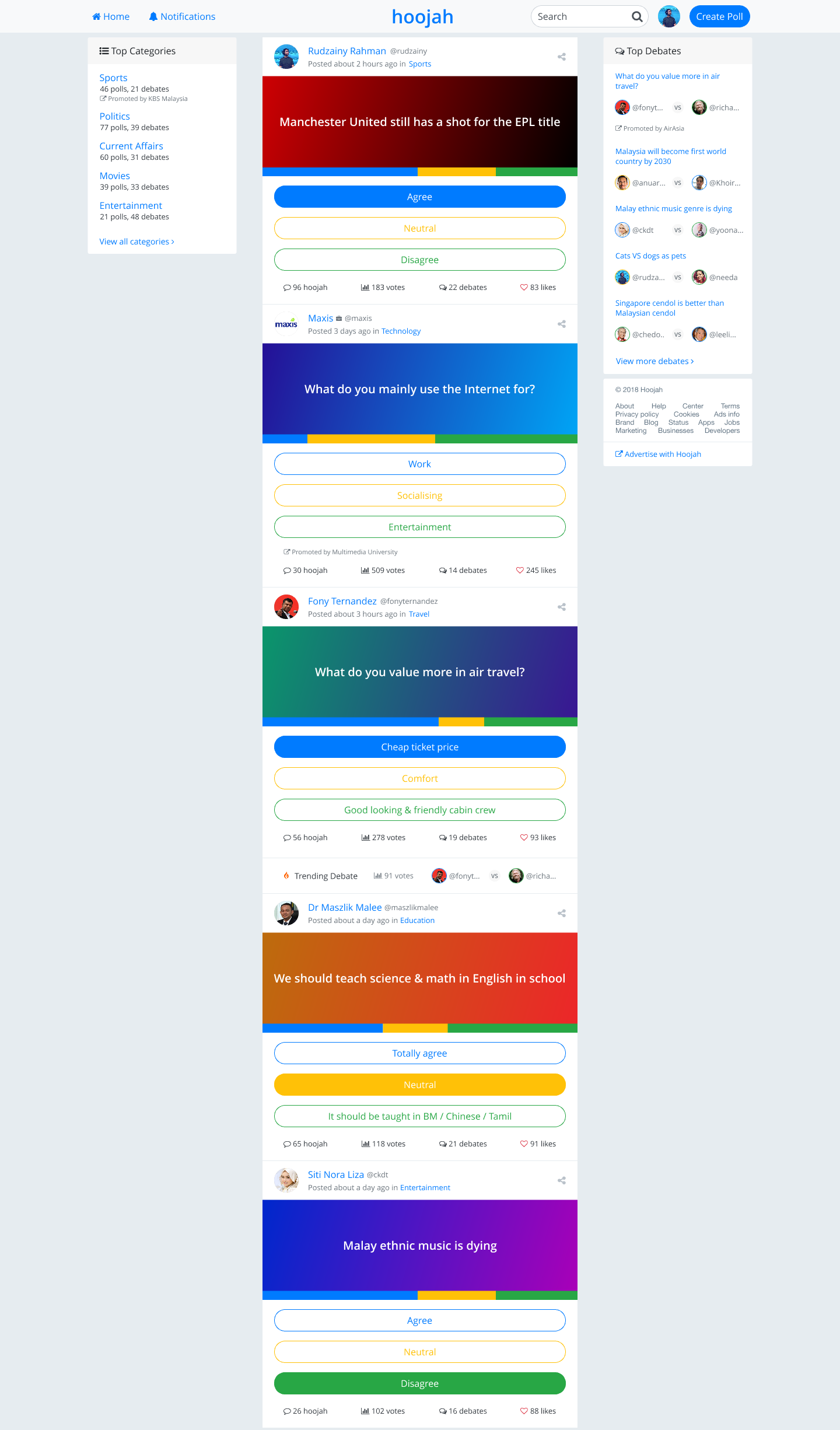
Home page showing timeline view of recently updated polls. Desktop users see additional information in sidebars.
Subjective discussions make decision-making difficult and eventually become noise. Open polls provide objective questions that deter subjective discussions.
System Architecture
Hoojah runs on a fairly standard modern stack: React on the front, Ruby on Rails at the back, Discourse handling the forum side, all wrapped in Docker. Nothing exotic. Just tools I could move quickly with while keeping the thing responsive.
            flowchart TD
              subgraph Client["Client Layer"]
                React["React Components"]
                SCSS["SCSS Styling"]
                API["API Clients"]
              end

              subgraph Server["Server Layer"]
                Rails["Ruby on Rails"]
                REST["RESTful API"]
                Auth["Authentication"]
              end

              subgraph Data["Data Layer"]
                DB[("PostgreSQL")]
                Redis[("Redis Cache")]
                S3[("S3 Storage")]
              end

              subgraph Services["External Services"]
                Discourse["Discourse Forum"]
                Analytics["Analytics"]
              end

              Client --> Server
              Server --> Data
              Server --> Services

              class Client,Server,Data,Services headerClass
              classDef headerClass fill:#f8f9fa,stroke:#495057,stroke-width:1px
              classDef default fill:#fff,stroke:#6c757d
Hoojah's system architecture showing the client, server, data, and external service layers.
Rationale for a 3-Options Voting System
One of the defining design choices in Hoojah is to restrict poll responses to three options: Agree, Neutral, and Disagree. That was deliberate, not lazy. After sitting through enough arguments online, I noticed that too many choices just made people freeze up, and the actual issue got lost in the middle.
Benefits
Clarity & Interpretability
Results are easy to read at a glance. You immediately see how the community leans: for, against, or neutral. That's the kind of simplicity I always wanted as a user myself.
Lower Barrier to Entry
Many people hesitate to join polls with too many nuanced options. Three simple choices feel intuitive, so more people take part. When I tried early versions on friends, they were happier to jump in once the choices were clear-cut.
Reduced Decision Fatigue
Nobody wastes time splitting hairs between "slightly agree" and "mostly agree." Contributing stays fast and lightweight, which was the whole idea.
Natural Grouping for Arguments
Supporting arguments automatically fall under one of three categories. That keeps discussions structured and stops the options from sprawling.
Balanced Representation
A "Neutral" choice avoids false polarisation and captures the people who are undecided or genuinely on the fence. Not every issue has only two sides.
Considerations
Limiting the options does flatten some of the nuance, no way around that. Hoojah gets it back by letting people attach supporting arguments under each stance, so the detail still comes through in the text and the debate. Getting that balance right took years of tweaking.
              erDiagram
                POLL ||--o{ OPTION : has
                POLL ||--o{ ARGUMENT : contains
                POLL ||--o{ DEBATE : hosts
                POLL ||--o{ VOTE : receives
                POLL ||--|| USER : created_by
                OPTION ||--o{ VOTE : selected_in
                OPTION ||--o{ ARGUMENT : supports
                ARGUMENT ||--|| USER : authored_by
                DEBATE ||--|| USER : participant_1
                DEBATE ||--|| USER : participant_2
                DEBATE ||--o{ DEBATE_POST : contains
                DEBATE_POST ||--|| USER : written_by
                VOTE ||--|| USER : cast_by
Figure 1b: Entity relationship diagram showing how polls, options, arguments, debates, and users interconnect in the Hoojah data model.
UI/UX Study: Solving the Convenience Problem
One of the biggest barriers to online debate platforms is plain convenience. People struggle to skim polls, follow arguments, and join in without friction. Hoojah tries to fix that with structured flows and a clear visual hierarchy. I care about this stuff. Cluttered interfaces have always annoyed me.
1. Poll-First Experience
Problem: Users want to see the poll outcome quickly without scrolling through long threads.
Solution: The poll sits at the top of the page, followed immediately by grouped arguments. This lets users vote, then dive deeper if they choose.
➡ Design pattern: "Decision at the top, discussion below."
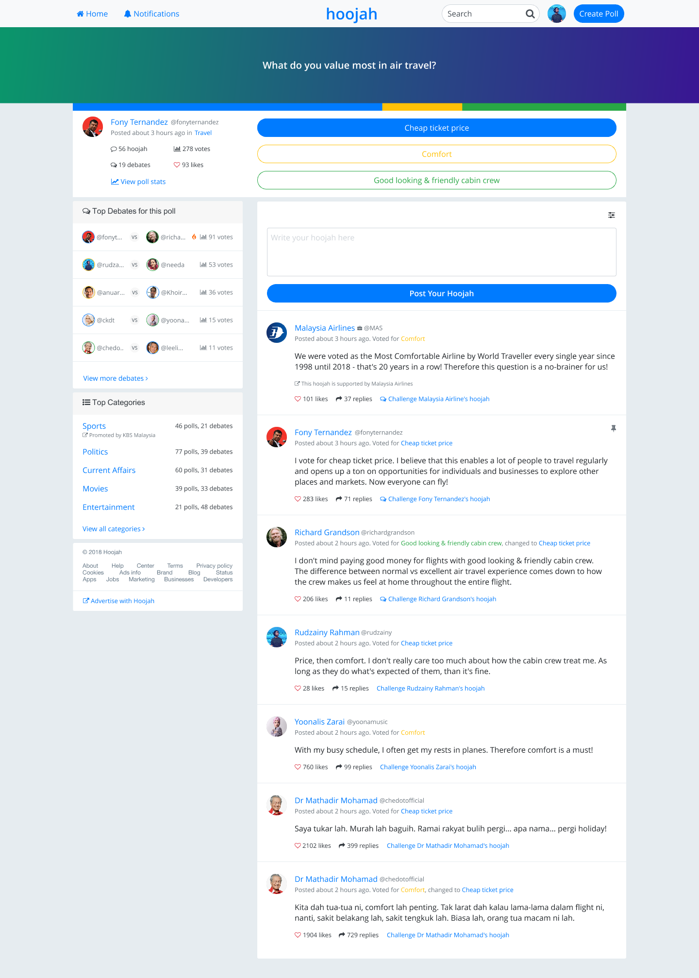
Figure 2: The poll-first layout, poll up top, discussion right underneath.
2. Grouped Arguments for Readability
Problem: Long, mixed comment threads are hard to follow.
Solution: Arguments are grouped under the option they support (Agree / Neutral / Disagree). Users skim within the stance they care about.
➡ Design pattern: "Categorical clustering" for quick scanning.
Problem: Open comment sections often devolve into noise and trolling.
Solution: Hoojah introduced debate view, where two users exchange structured arguments. This reduces clutter and highlights meaningful back-and-forth.
➡ Design pattern: "Focused debate lens" to isolate quality interactions.
Figure 4a: Debate mode in action.
                sequenceDiagram
                  autonumber
                  participant U1 as User 1
                  participant H as Hoojah
                  participant U2 as User 2

                  U1->>H: Challenge to debate
                  H->>U2: Notify of challenge
                  U2->>H: Accept challenge
                  H->>U1: Debate initiated

                  Note over U1,U2: Structured Debate Begins

                  U1->>H: Opening statement
                  H->>U2: Display statement
                  U2->>H: Counter argument
                  H->>U1: Display counter

                  loop Debate Exchange
                    U1->>H: Response
                    H->>U2: Display response
                    U2->>H: Response
                    H->>U1: Display response
                  end

                  U1->>H: Closing statement
                  H->>U2: Display closing
                  U2->>H: Closing statement
                  H->>U1: Display closing

                  Note over U1,U2: Debate Concluded

                  H->>U1: Archive debate
                  H->>U2: Archive debate
                  H->>H: Make debate public
Figure 4b: Sequence diagram showing the structured flow of a one-on-one debate in Hoojah.
4. Participation Made Simple
Problem: Many platforms hide contribution behind too many steps.
Solution: Clear calls-to-action: vote in one tap, add a supporting argument in two, start a debate in three. Minimal cognitive load.
➡ Design pattern: "Progressive participation" where each step feels natural.
Figure 5: Streamlined CTAs, vote in one tap, add an argument in two, start a debate in three.
5. Mobile vs Desktop Consistency
Problem: Debate platforms often break on smaller screens.
Solution: On desktop, sidebars show trending arguments and user profiles. On mobile, non-essential elements collapse, leaving poll + arguments as the core flow.
➡ Design pattern: "Responsive hierarchy" that prioritises core actions.
Figure 6: Responsive design across phone and desktop.
User Journey Snapshot
See poll at a glance → choose Agree / Neutral / Disagree.
Read grouped arguments under the chosen stance.
Join discussion by adding a supporting argument.
Escalate to debate if deeper engagement is needed.
Track contributions through personal profile and timelines.
This flow is what all the iteration eventually settled into. Watching the first beta users move through it more or less the way I'd hoped was a good day.
            flowchart TD
              A["User Visits Hoojah"] --> B["View Poll Question"]
              B --> C{"Choose Stance"}
              C -->|"Agree"| D1["View Agree Arguments"]
              C -->|"Neutral"| D2["View Neutral Arguments"]
              C -->|"Disagree"| D3["View Disagree Arguments"]
              D1 --> E["Read Supporting Arguments"]
              D2 --> E
              D3 --> E
              E --> F{"Engage Further?"}
              F -->|"Yes"| G["Add Supporting Argument"]
              F -->|"No"| H["Continue Browsing"]
              G --> I{"Start Debate?"}
              I -->|"Yes"| J["Initiate One-on-One Debate"]
              I -->|"No"| H
              J --> K["Exchange Structured Arguments"]
              K --> L["Debate Concludes"]
              L --> M["Track via Personal Profile"]
              style A fill:#f9f9f9,stroke:#6c757d
              style B fill:#e3f2fd,stroke:#0d6efd
              style C fill:#fff3cd,stroke:#ffc107,stroke-width:2px
              style D1 fill:#d1e7dd,stroke:#198754
              style D2 fill:#cff4fc,stroke:#0dcaf0
              style D3 fill:#f8d7da,stroke:#dc3545
              style F fill:#fff3cd,stroke:#ffc107,stroke-width:2px
              style I fill:#fff3cd,stroke:#ffc107,stroke-width:2px
              style J fill:#e2e3e5,stroke:#6c757d,stroke-width:2px
              style K fill:#e2e3e5,stroke:#6c757d
              style L fill:#e2e3e5,stroke:#6c757d
              style M fill:#f8f9fa,stroke:#6c757d
Figure 7: Interactive user journey flow showing the path from viewing a poll to engaging in structured debates.
Key Takeaways
Restricting to three voting options balances simplicity with room for real debate. Constraints can be a feature, not a compromise.
Convenience comes from readability, structured flows, and a responsive layout, roughly in that order.
Hoojah keeps friction low by walking people from poll → arguments → debate, one step at a time. I learned more about how people actually use software from building this than from anything I read.
Looking back, Hoojah is where I actually grew up as a designer and developer. It started as a side project and ended up teaching me to listen, ship, tweak, and keep solving the real problem instead of the fun one.
03 · what it had to do
Hoojah's Objectives
Create a platform for structured objective discussions where arguments are tied to polls with three options: agree, neutral, or disagree.
Encourage users to respond objectively to promote quality discussions and ethical online engagement.
Establish a trustworthy space by verifying user identities to eliminate noise in online discussions.
A poll page showing three main interactions: voting, adding arguments, and one-on-one debates.
04 · still alive
Moving Forward
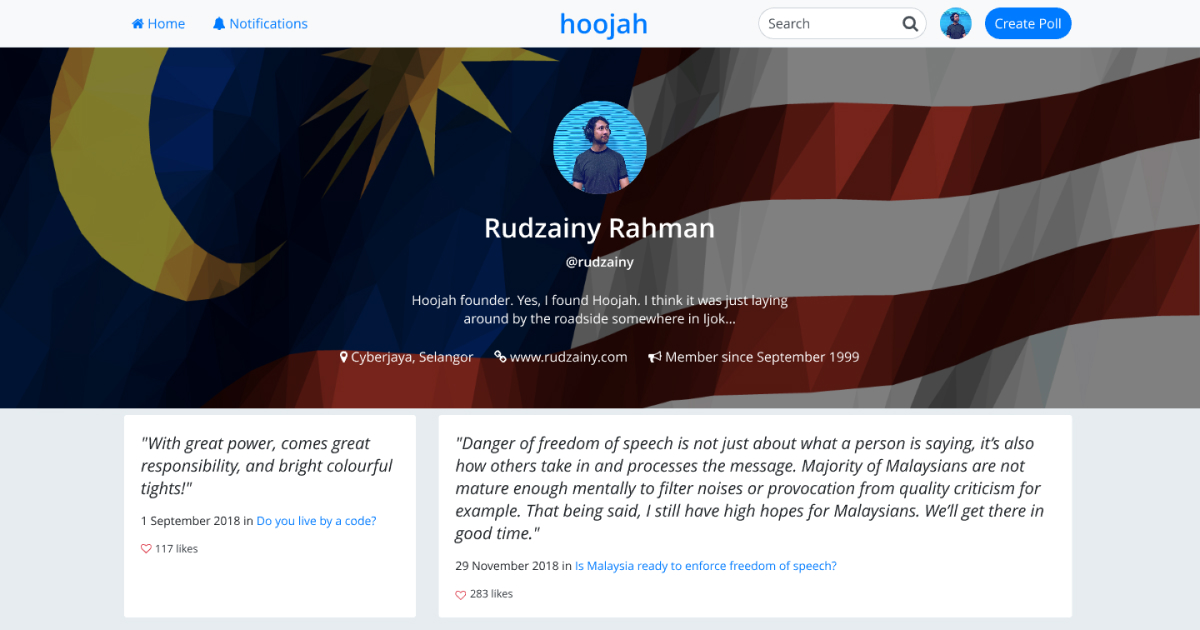
The old hoojah.my domain is gone, however Hoojah is very much alive and now lives at hoojah.rudzainy.com. I've since rebuilt it as a live, server-rendered Rails 8.1 app on Hotwire, and the one-on-one debate feature (challenge, turn-based rounds, then a spectator verdict) is actually built now, not just a diagram in this case study. All those hours spent tuning the UI taught me patience, and to keep iterating on real feedback instead of my own assumptions. I carry that into every project now.
05 · screens from it
Showcase
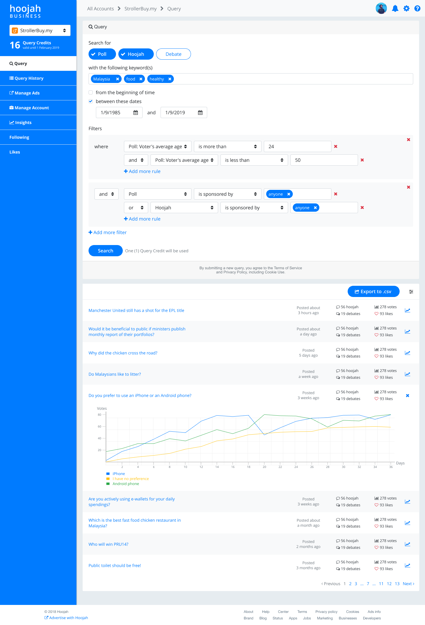
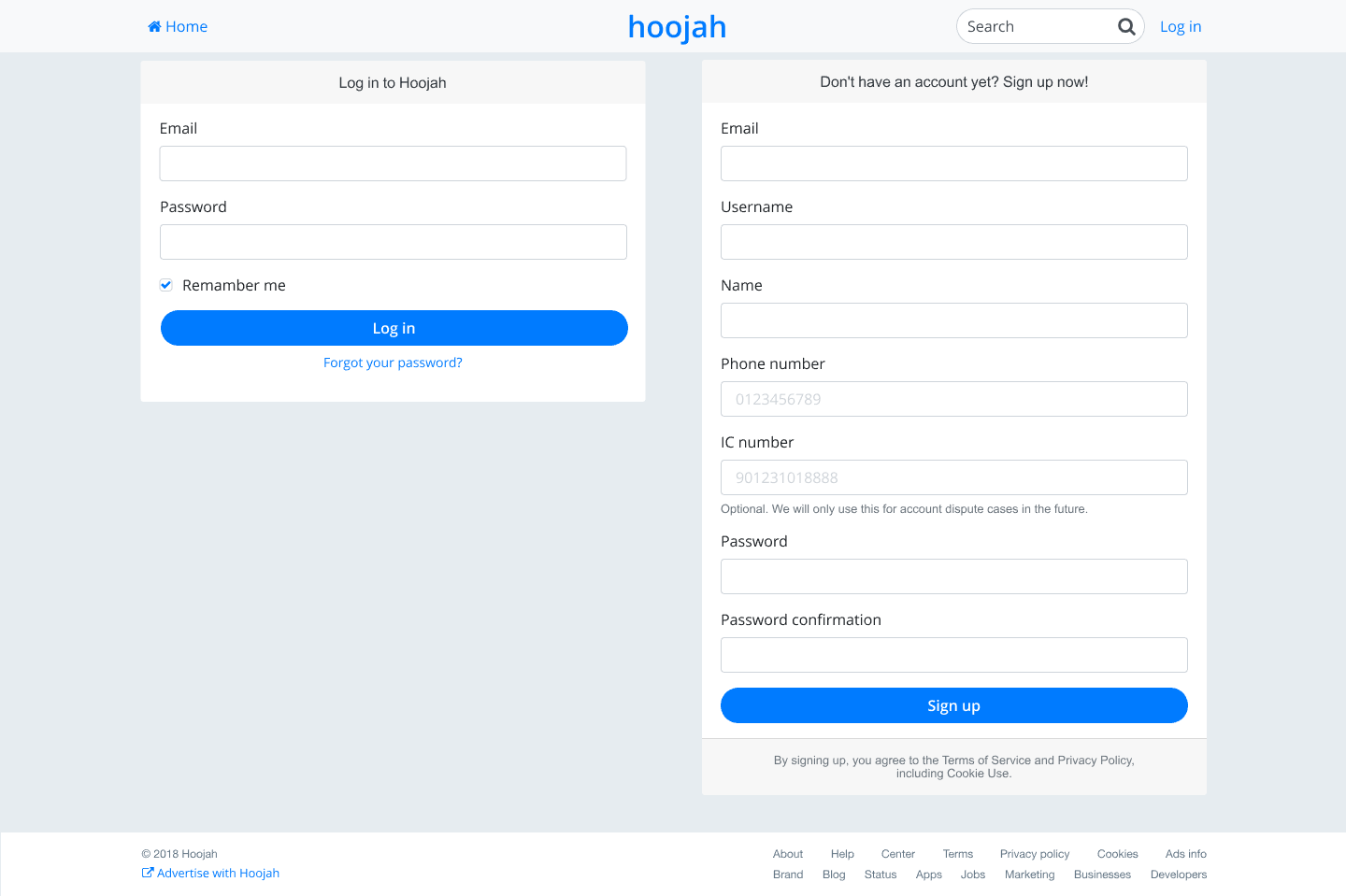
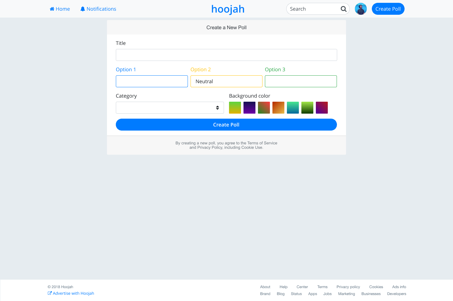
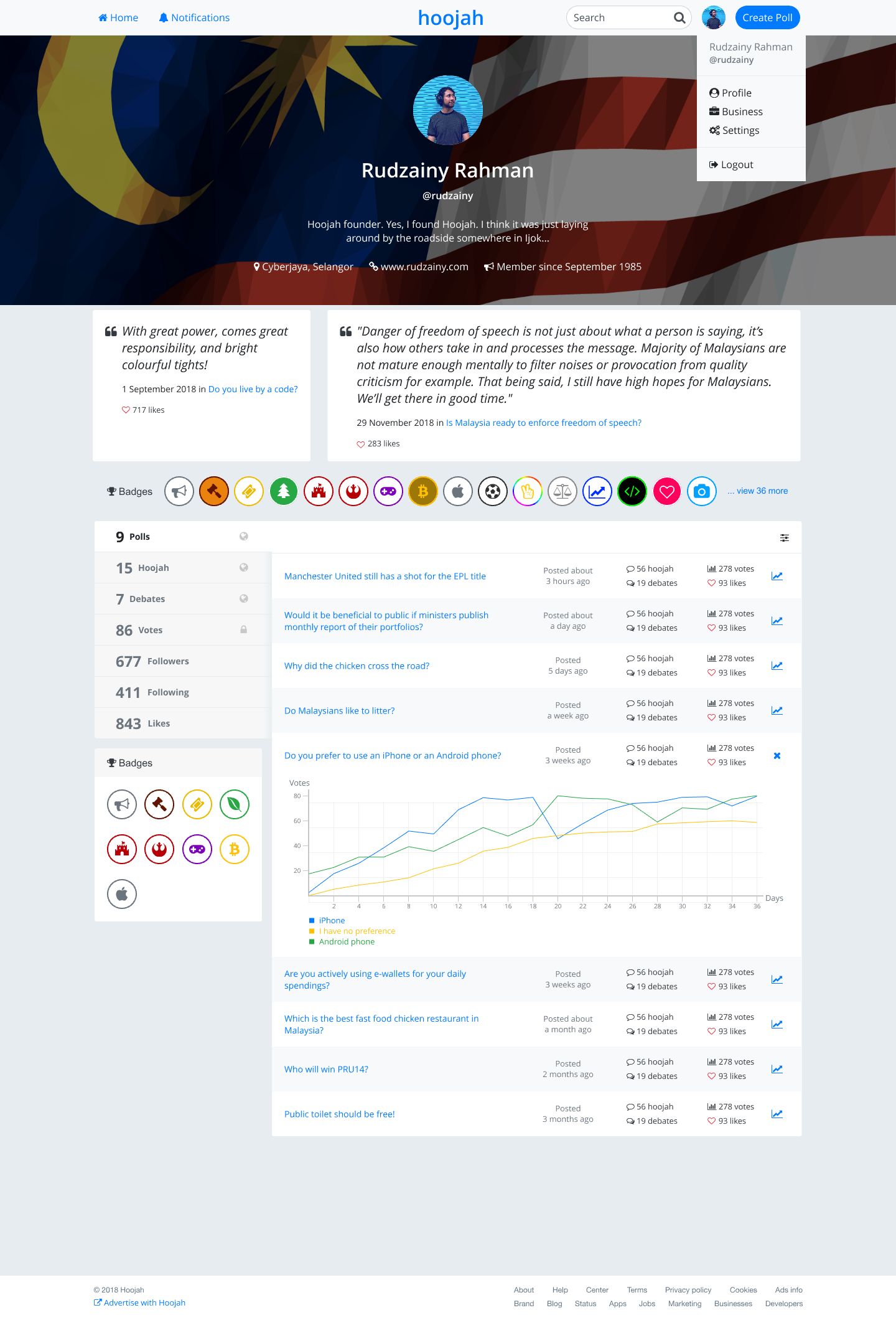
Debate page showing engagement between two public figuresAnalytics page for business usersCombined login/signup page with mobile optimizationPoll creation interface with customization optionsUser profile with achievement badges